M&S
Creative Director: Andy Lewis
Product Owner: Amy Flavell
UX Researcher: Bhiru Shelat
Junior PM: Anjanaa S. N.
Data Analyst: Martin Isaac
Merchandising Lead: Nick Murray
#PROPOSITION DEVELOPMENT #UI DESIGN
Sparks Plus - from corporate paralysis into retail reality
After eight months of Miro boards and agency decks, M&S were stuck in concept hell with their first premium subscription. I joined for a 90-day sprint to break the deadlock and turn a nebulous idea into a living, breathing trial. As an external disrupter, I acted as the glue between the business vision and the digital reality—defining the value exchange, designing a premium identity, and hacking the existing website and app to give trial members a bespoke experience that felt world-class from day one.
To move from paralysis to evidence, I took the product team out of head office and onto the shop floor at heavy-hitter stores like Hedge End and Brooklands. We set up a high-fidelity pop-up to prove the proposition's desirability. The result was gold dust: a 25% conversion rate on the spot, giving senior stakeholders the confidence they needed to green-light the pilot. By the time I finished my three-month stint in September, we had moved from post-it notes to a live, payment-ready digital trial that proved M&S could move fast and deliver a premium service that customers actually wanted.


External disruptor
I was brought in for a three-month sprint with a dual mandate: act as the Creative Director to define the brand and the UI/UX, but also behave as a objective misfit to inject pace into a stagnant product pod. My team included a product owner, data specialist, and UX researcher, but there was a clear disconnect between the head office strategy and what a customer would actually value. I spent my first two weeks in total immersion—reading every playback deck and interview transcript to find the signal in the noise.
To break the deadlock, I started by whiteboarding a long-list of every possible feature discussed over the previous eight months. Working alongside the UX researcher, we mapped these on a sliding scale of customer desirability. We then took this list to an internal M&S digital convention, using the staff—who are the ultimate proxy for the M&S customer—to perform a card-sorting exercise. This allowed us to ditch the ‘nice-to-haves’ and focus on a high-conviction shortlist that we could finally present to senior stakeholders as a tangible proposition.


Visualising premium: the black marble identity
A subscription service needs to look like it's worth the monthly fee. The existing core Sparks brand uses vibrant greens, but for ‘Sparks Plus’ I needed a visual shorthand for premium. While the external agency had toyed with some brand marks, I pushed for a more artisanal, high-end feel. We paired the signature Sparks green with silver on a subtle black marble texture—evoking the prestige of high-end hotels and restaurants. I even refined the brand mark, adding a flowing brushstroke to the "plus" to give the identity a sense of energy and movement.

The fake-door roadshow
With a high-fidelity brand in hand, I told the product team we were leaving the office. We took our ‘Sparks Plus’ pop-up stand to two of the brand’s heaviest-hitting stores: Hedge End and Brooklands. Using a fake-door strategy, we presented the concept to shoppers as if it already existed. The goal was to move past opinion and get to commitment. We asked customers for a show of intent: "Are you interested enough to give us your email?"

Hypothesis smashed - the 25% conversion
The results from the store visits were a total game-changer. Our initial hypothesis was that a 5% sign-up rate would prove the concept had legs. Across the two stores we saw a staggering 25% conversion rate—one in every four people we spoke to signed up on the spot. This wasn't just data; it was gold-dust evidence that silenced boardroom doubt and provided senior leadership with the "political cover" they needed to green-light a live pilot.
Hacking the digital journey
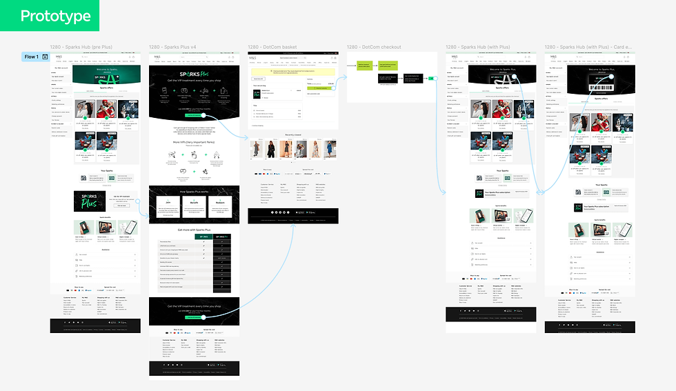
With the pilot approved for September, we had to build a digital experience for 100 trial members in record time. Since the backend for a subscription model didn't technically exist, we had to "skin" the existing app architecture. I developed a UI kit that transformed the standard Sparks hub into a gated, Sparks Plus experience. We designed the on-boarding journey, membership interface, and bespoke offer cards, transforming parts of the existing interface so that the moment a member signed up, their digital experience reflected the premium price point they were paying.

Operationalising the experience
A loyalty scheme is only as good as the service it provides. We spent the final weeks of the sprint bridging the gap between digital design and store operations. This meant training staff at Hedge End and Brooklands to understand the new ‘Sparks Plus’ perks—including exclusive out-of-hours seasonal launches and personal styling sessions. We built the UX journey for booking these stylists, piggybacking on existing systems to ensure the 100-person trial felt like a seamless, high-touch service from day one.

From post-it notes to pilot in 90 days
By the time my three-month stint ended in September, the ‘Sparks Plus’ trial was live. We had successfully moved from eight months of corporate paralysis to a functioning, payment-ready pilot. By proving the desirability in-store, hacking the feasibility in the app, and testing the viability of the service, I left the M&S team with a tested blueprint for the future of their loyalty strategy. It was a definitive win for lean experimentation and evidence-led design.

