M&Ms
Creative Director: Andy Lewis
UX Designer: Miki Chiu
Graphic Designer: Emma Sokell
#MERCHANDISING GUIDELINES
#INFORMATION ARCHITECTURE
How to systemise a global retail phenomenon
M&M’s experiential stores are more than retail spaces; they are global tourist destinations. However, without a central "source of truth" for visual merchandising, the brand’s ambitious global franchise expansion was at risk of fragmentation. Stepping in as Creative Director, I led a high-performance team to consolidate a mountain of scattered PDFs, architectural drawings, and seasonal guides into a singular, exhaustive 200-page Global Merchandising Manual. By treating the document as a functional product rather than just a brand book, we built a scalable system that allowed M&M’s to franchise their theatrical retail model with absolute consistency across any region or culture.
To manage the sheer volume of content, I architected a layered production line. This involved bringing a UX specialist into the VM world to wireframe the document’s information architecture before a single page was designed. We transformed a chaotic archive into a navigable, four-section operating manual, using a character-led colour-coding scheme to ensure franchisees could jump from "Shelf Strips" to "Window Displays" in seconds. The result was a definitive, 200-page master manual that took M&M’s from a collection of scattered resources to a unified, franchise-ready global powerhouse.


A global giant without a map
M&M’s retail stores are more than just shops; they are high-octane, experiential tourist destinations. From London’s Leicester Square to Shanghai, these flagship hubs are the pinnacle of the brand’s physical presence. However, as the business prepared to franchise this model globally, they hit a significant roadblock: there was no single source of truth. The institutional knowledge was trapped in a fragmented mountain of PDFs, PowerPoints, and architectural drawings. To scale, M&M’s needed to move from a collection of scattered resources to a unified, systemised retail operating system.
The pitch: selling the finish line
Winning the project meant competing against high-tier brand agencies. While our proposal was airtight on timelines and team structure, the clincher was a high-conviction creative teaser. Before we had even won the work, I led the team in mocking up sample spreads. We used their iconic yellow-and-brown palette, characters, and typography to show exactly how a complex "Store orientation" or "Clothing merchandise" section would look. By making the abstract tangible during the pitch, we proved we weren't just designers—we were the partners who already understood their brand’s DNA.

UX-led orchestration: The production line
With a 200-page document on the horizon, I knew we couldn't just design our way through it. I architected a high-performance layered production line that treated the document like a piece of software rather than a book. In a move that surprised the stakeholder, I brought a UX Designer into the heart of the project to act as our project manager and lead architect. Before a single page was designed, we wireframed the entire Information Architecture (IA), treating the Store Manager as our primary user. This ensured that our four-person production line—from the merchandise writer to the lead designer—was working from a functional map that prioritised usability over mere aesthetics.


Quality control at scale
One of the greatest risks to a global manual is poor-quality source material. I positioned our UX/Project Manager as the "Asset Sentry." Every photograph, diagram, and architectural flat-plan provided by the stakeholder went through a rigorous filtering process. If an image wasn't print-ready or a diagram lacked the necessary detail for a franchisee, we pushed back immediately. This diplomatic quality control ensured that the lead designer only worked with high-fidelity assets, preventing a bottleneck of bad data from stalling the production line.
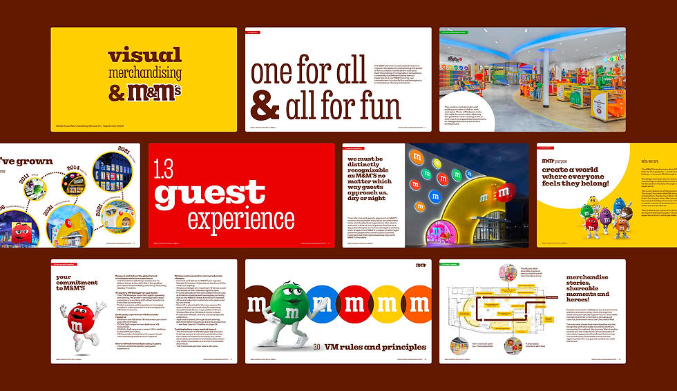
Building a "visual GPS"
M&M’s is a brand built on characters, and we leveraged that equity to solve a navigation problem. With four exhaustive sections covering everything from POS signage to seasonal Halloween displays, the reader needed to know exactly where they were at all times. We developed a colour-coded "visual GPS" tied to the M&M’s characters—Yellow, Brown, Red, and Green. By jumping between colour-coded chapters, a franchisee could navigate the 200-page beast instinctively, making the document as playful as the brand but as precise as an engineering manual.

Systemising the theatrical
The final output was a masterclass in "systemising the theatrical." We took the chaos of an experiential retail environment and broke it down into repeatable, modular instructions. Whether it was the specific height of a shelf-talker or the lighting requirements for a window display, every element was documented with absolute clarity. We provided M&M's with their first-ever "Single Source of Truth," enabling them to franchise their unique brand of retail theatre to any major city in the world with total consistency.

A franchise-ready powerhouse
Though we initially advocated for a digital-first portal, the final 200-page PDF became the definitive "Franchise Bible" for the M&M’s global team. It bridged the gap between the head office's vision and the store floor’s reality. By the time we hit export, we had delivered more than just a manual; we had built the infrastructure for global expansion. The project solidified our reputation within Mars as the team that could take a mountain of content and turn it into a high-performance brand asset.


