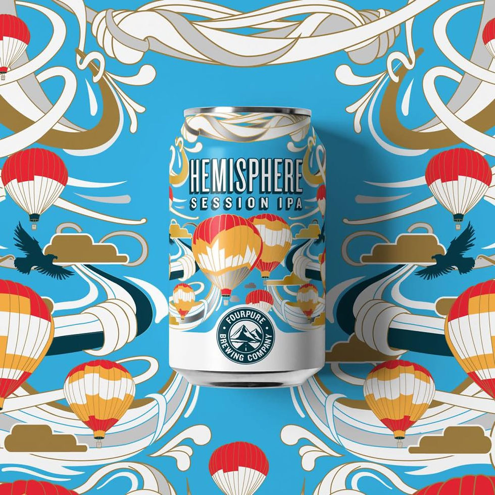
Four Pure
Creative Director: Andy Lewis
Consultants: Amanda Howe, Rory Keddie, Sam Deeble
In-house Designer: Dan Mynard
#Brand STRATEGY #LEAN BRANDING
Three weeks to steer a lost brand on a course for adventure
Four Pure was founded on a love for travel and exploration, but the brand was suffering from a profound crisis of confidence; the founders’ original ethos had been traded for a "vanillified" aesthetic that felt safe, corporate, and ultimately invisible. The visual identity was anchored by a wheat motif—startingly similar to a certain breakfast cereal—which signaled "agriculture" rather than "exploration." Our task was to use a three-week lean branding exercise to diagnose the disconnect and provide a roadmap for a brand that actually lived up to its name.
Conducting 15 deep-dive interviews and a 150-respondent survey, we mapped the market against five core personas, and identified a lucrative "Explorer" middle-market. Hosting a live "design speed dating" event at the brewery we proved that 75% of drinkers valued illustrative storytelling over the brand’s current aesthetic.
This evidence-led approach gave the board the necessary "political cover" to pivot, revealing that the name of the beer—not its style—was the primary driver for purchase. We replaced commodity labels with evocative names like "Basecamp" and empowered their in-house design talent to build a new visual system around a new travel-patch brandmark and large-scale illustrations. The project serves as a definitive case for lean experimentation, proving that even on a fifeteen-day timeline, getting close to the customer can bridge the gap between business vision and customer reality to build genuine market equity.

The commodity trap
A major symptom of this confidence crisis was the naming convention of the core range. While competitors were building brand equity with evocative titles, Four Pure had regressed into functional descriptions. Their products were simply named "Lager," "Stout," and "Session IPA." In a market where craft drinkers buy into stories and motives, this "substance-only" approach turned their beer into a commodity. We identified that by failing to name their beers, they were effectively opting out of the brand-building race and leaving their most powerful sales tool on the table.

The Nielsen reality check
To provide the board with an undeniable "Proof of Life," we conducted a competitor audit of the Nielsen Top 20 highest-selling craft beers. The data was a wake-up call: nine out of the top ten leaders used evocative brand names rather than generic styles. By mapping these rivals across a spectrum of Illustrative, Typographic, and Minimalist designs, we showed the founders exactly where they were "invisible." The evidence was clear: the market leaders weren't selling liquid; they were selling a character that Four Pure was currently lacking.

High-velocity diagnostics
With only fifteen days on the clock, we couldn't rely on traditional, slow-moving agency cycles. We split our research into two high-intensity pools: 15 in-depth interviews to understand "the why" behind beer drinking habits, and a 150-respondent survey to quantify "the how." This dual-track approach allowed us to move beyond subjective opinions and build a fact-based "Customer Pyramid." We identified that while the "Craft Connoisseur" was a vocal minority, the real growth opportunity lay with the "Explorer" and "Experiential" drinkers who crave a journey with every pint.


Show, don’t tell – The brewery sprint
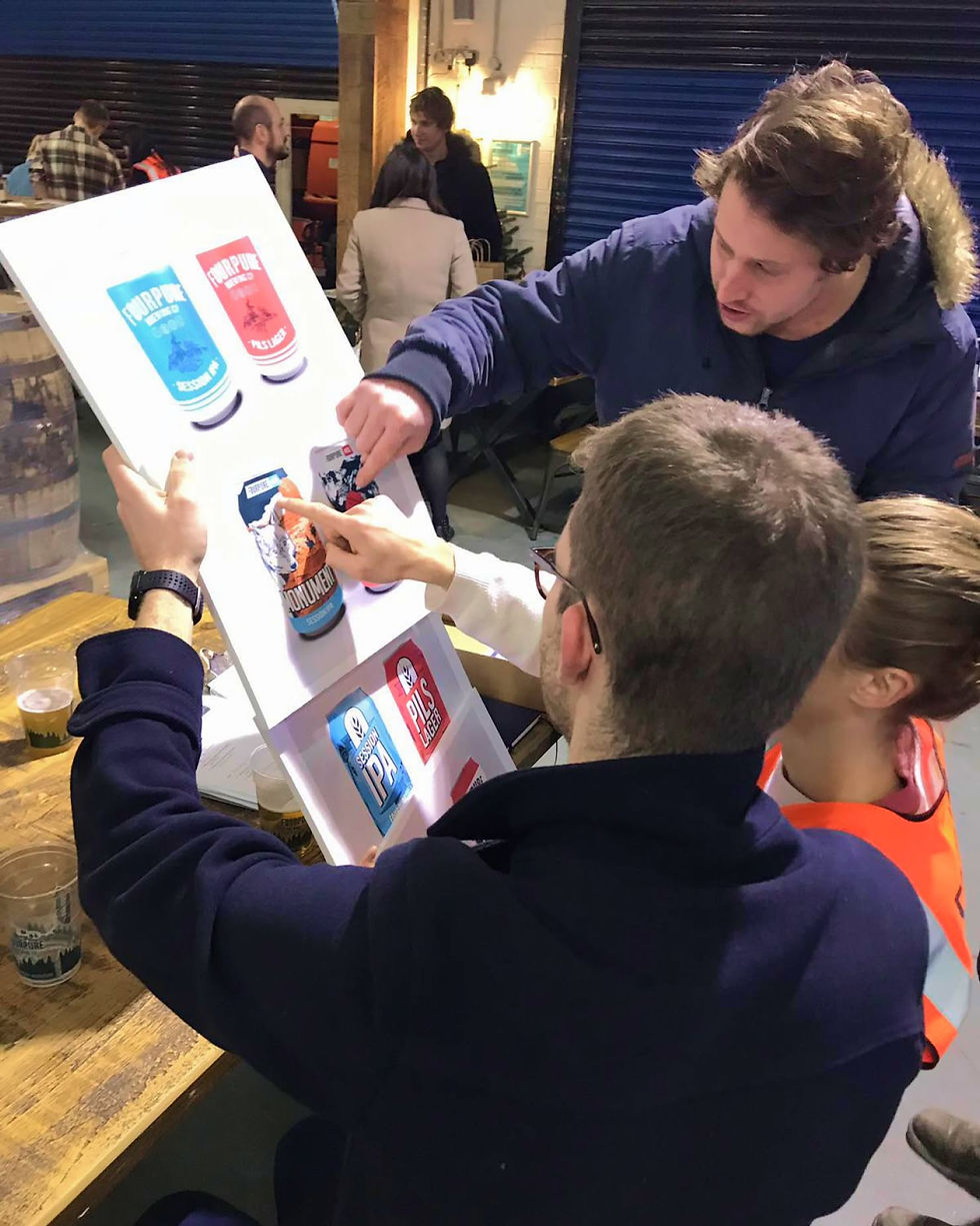
The project culminated in a "piss-up in a brewery" with a strategic purpose. We invited 24 participants—a mix of loyalists and non-craft drinkers—to move through five activity stations designed to stress-test our hunches. The Card Sorting station was a turning point; when founders watched their logo consistently ranked as "Agricultural" and "Boring" compared to adventurous rivals, the need for change became visceral. This live environment transformed abstract strategy into a high-fidelity feedback loop that the leadership could no longer ignore.


Design speed dating
During the event, we ran a "Design Speed Dating" session to test three potential visual directions: Illustrative, Minimalist, and Crest-based. Working closely with in-house illustrator Dan Maynard, we produced "scamps" that paired bold, new names like "Alpine" and "Monument" with evocative artwork. The result was a landslide: 75% of participants voted the illustrative designs as the most inspiring of adventure. This didn't just prove our design hunch; it empowered the internal team by showing that the talent to save the brand was already sitting in the building.


The "Basecamp" breakthrough
One of the most significant outcomes of the naming workshops was the birth of "Basecamp." We proposed this name as a bridge between the founders' travel roots and the consumer's experience—a starting point for a journey. The data from our survey had already confirmed that the "Name of the Beer" was the number one driver for purchase, ranking higher than ABV or brewery location. By moving away from "Lager" and towards "Basecamp," we gave the brand a narrative hook that resonated with the Explorer persona we had identified.
The lean legacy
The impact of this three-week sprint was felt long after we left the brewery. Following our recommendations, Four Pure underwent a full brand refresh, retiring the wheat motif in favour of an adventurous "travel-patch" mountain logo. They embraced an illustrative can system that gave their artwork the space it deserved and renamed their entire core range, with Basecamp becoming a flagship product. By using lean experimentation to back every creative choice with hard numbers, we moved the founders from a crisis of confidence to a position of market strength.