Magnetic
Creative Director: Andy Lewis
Designers: Emma Sokell, Miki Chiu, Sam Pickering,
Louiza Cookson-Rabouhi
Editor: Jacqui Gibbons
#BOOK Design #MARKETING
Designing Optimism: crafting the ultimate C-Suite door-opener
Every year, Magnetic produces a flagship book as its primary marketing tool—a premium 'leave-behind' designed to stay on the desks of CEOs and board members long after we’ve left the room. For the 8th edition, themed 'Optimism,' I brought the creative direction in-house for the first time, transforming it from a beautiful outlier into a definitive proof of our internal design expertise.
By leading a team of five talented graphic designers and illustrators through an editorial 'playground' of flexible grids and vibrant Pantone palettes, we created a harmonious yet disruptive artefact. The result was more than a book; it was a cultural moment that celebrated our 'mischief-making' spirit, impressed our future acquirers at Newton, and remains the primary door-opener for our highest-value new business conversations.


Bringing excellence home
Historically, Magnetic’s yearly books were beautiful but felt like strangers to our core brand. They were outsourced to external designers who often drifted into 'left-field' aesthetics. For the Optimism edition, we kept the project entirely in-house. I wanted this book to be an authentic artefact of Magnetic’s own design skills—a showcase of our ability to handle complex, high-end design work for the world’s biggest brands.


Building the system
To manage a project with such diverse content—from client case studies such as PepsiCo to Gen Z trend reports— we designed a 'playground' with strict boundaries. A design system, to allow our different designers to flex their skills, while also contributing something that was going to be harmonious.
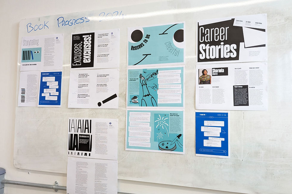
Typography: We introduced Adobe Miller for a sophisticated long-form reading experience and Gazetta, a seasonal display typeface that allowed us to treat 'Type as Image' for our hero headlines.
The rule of three: To ensure a vibrant but cohesive look, we limited the palette to three high-impact colors: Magnetic Blue, Magnetic Mint, and Black.
The grid: we developed a flexible 2-3 column underlying grid, giving our designers the freedom to play while maintaining a consistent structural heartbeat throughout the book’s pages.


Providing creative direction
Managing five designers on a single book requires a balance of autonomy and alignment. Working alongside my Lead Designer, Emma Sokell, and our Editor-in-Chief, Jacqui Gibbons, we 'cast' our designers based on their unique strengths. We gave the clean, long-form editorial to our lead designer and assigned the more ‘pop-culture’ spreads to designers with a strong focus on trend-led work.
By encouraging each designer to bring three or four 'takes' to their assigned spreads, we fostered a design-lab environment. The result was a 'fanzine' energy—diverse and experimental—held together by our strict Pantone and typography guardrails.

Designed for the commute
We know our audience. Our clients are CEOs and executives who are constantly on the move. We maintained a portable, smaller-than-A5 format so the book could live in a work bag and be read on a commute.
To make it feel high-end, we focused on the 'reveal': a vibrant, 100% Magnetic Mint hardcover (with easter egg) wrapped in a lightweight Deep Blue sleeve. We chose uncoated paper stock to give it an artisan, human feel. Despite being over a year old, the choice of true Pantones ensures the book still feels 'fresh off the press' today.


The Impact: The ultimate door-opener
The launch of Optimism became a defining moment for the company. It wasn't just a marketing asset; it was a moment of celebration for the team that built it. It gave our leadership a powerful tool to 'butter up' potential clients, acting as a physical representation of our thought leadership and design maturity.
While the acquisition of Magnetic by Newton was already in motion, Optimism served as the final evidence of our value. It proved that we weren't just 'smart consultants,' but a high-end design powerhouse capable of turning dense, complex information into a story that people actually want to hold in their hands.
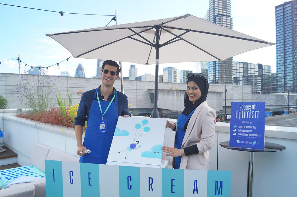
Optimism - a celebration
Having created the perfect on-brand book, it deserved to be celebrated at its own book launch. Here are some highlights of how the campaign extended into the event design, artwork repurposed from the book, including a 20ft high bookmark to transform the space into a special occasion for the team and client guests...